

Introduction To BA2b
This next uni for BA2b is focused around the idea of collaboration in a range of activities. The unit itself will provide the space in whicb i will work collaboratively alongside peers, exchanging diversity, ideas and skill sets. By exploring different roles within a creative community, i will experience how my skills can be activated and applied to engage the public. This unit will also help me develop my skills within my creative practice and ideas in contemporary illustration.
In this uni, there are three choices of project that i can pick alongside two essays. I was given the three main briefs for this project, and at first none of the project briefs really interested at me at a first glance.After reading the briefs again, i was interested in the third project which is situared around the architecture. Since i have come to university, i have gained an interest and respect for architecture but i dont like the idea of making 3D models in a graphical sense. I feel that my mathematical skills would be tested and i am not strong when it comes to making technical products.
I choose to do the editorial brief which is called 'Variations' as this seems to be very experimental, open and creative thinking. My promt i have chosen is called: Man vs Rat: When Will The War End?. This article interests me as it around the idea of a rodent which is considered to be a pest. I also would like to experience the working methods of creating editorial work , through illustrations and digital animations.
I feel a little lost where to start off with this project. I feel that i cant really do much until i have joined the workshops situated for this brief in the studio with other peers, For now i will read the text, pick out things that stick out to me and make sketches.
Man Vs Rat Article
I read the article that was given to me called 'Man Vs Rat: When Will The War End?'. This article is based on the struggle that the human population has had with rats and our relationship with them over the years. The article talks about ways we have tried to eliminate rats by poisoning them and using other animals to kill them. The article goes on to talk about a rat birth control pill which is a more humane way to control the population of the rat to make a safer and healthier environment.
This is a long detailed article which was published for The Guardian newspaper. To begin my research, i have read the article ans highlighted particular areas that have stood out with me in different highlighter colours to signify different subjects and themes. I have only shown one page of the highlighted article as their are 10 altogether and it would be too much to show. Its interesting to know that the 10 page article mentions the word rat 100 times throughout the whole issue and speaks in detail about rats in general and how they work.
I have written on the side of the pages areas of the documentation that interest me and that i could possibly bring to light through my creative practice in this project through deeper research and experimentation. For example, the first page speaks about the term 'King Rat' This is when a group of rats have had their tails intertwined with each other and haven't been able to escape. Another interesting theme is their bad reputation on a whole and how they are linked to disease and death.
This is a good starting point to my research, I am going to research further into this by researching:
-
Term 'King Rat'
-
Rats in general
-
How they have achieved a bad reputation
-
rats throughout history.
I believe researching these starting points will bring me a deeper insight into this original article i have been told to study and help my creative practice in this project through primary and secondary research, experimentation, development and finally an outcome.

Article Extract Sketches
Based on the article 'Man Vs Rat', I picked out some themes that i highlighted and have made some initial primary sketches. The first one to the left is a continuous line drawing of a pack of rats in different compositions and proportions. I decided to use the continuous line method because the technique allows you to work in a messy, chaotic manner. I feel the nature of the rat itself it also like this, messy and chaotic, This technique also flows from one image of a rat to another, bringing a sense of connectivity and mass of them. This reflects the idea of rats being a global and connected problem throughout different countries of the world.
I feel working in this way allows for a loosee way of working which is out of my comfort zone because i like to work in tight, intricate detail. I want to work in this way again. To do this i might incorporate colours that are sketches in this technique with marker pens or pencils.


The next initial sketch on the left is of a rat that been poisoned by rat bait. This has been done in ink and quill to allow for more detailed but loose flow of ink, allowing for this messy, scratched approach to the outcome.
The bait has been inked in green ink to suggest travel from the bait itself to the ultimate death of the rat.

I focused on the brief given to me which wast to make sketches using 3 colours. I thought about what colours reflect the nature of a city rat and to me the colours green, black and brown spoke out to me. They are all natural and accosicated with dirt, death and disease.
This particular sketch is based on the theme of city rats scavenging for food in and around the city streets and alleyways. They have been quickly sketched to give them a basic shape and composition situated around the garbage bin. I like the idea of basing the work on 3 main colours to give a narrative through the use of colour, shade and tone. With pens you do not really get tone and shade in a gradient fashion so i may use different mediums to do this.

I used different primary colours to sketch continuous line drawings of different rats. I didn't really think about the composition for this piece but more about the joining of colours through the layering of different lines on top of each other and what they create.
Maybe next time i try this sketch with coloured pro markers, i will focus on layering the same image on top of each other with different colours so see what it creates in a patterned and transparent outcome of colours.
Types Of Illustration

For my next studio workshop, i have been asked to bring in examples of spot, single and double page illustration. In my own creative practice i would say that my work is focused around spot illustration as it has no backgrounds and is very informative and technical.
Double Page: The image to the left is by artist, Yuko Shimizu for a double page illustrated front cover. The whole image is stretched right around the body of the book itself and the detail of the full image suggests a more obvious way of storytelling and narrative.

Spot Page: Spot illustration is used to bring out one or few partiuclar theme without having a background. A good example of this is by one of my favourite illustrators, Katie Scott. She uses the spot page technique as a way to compose educational images.
This way of getting out a page is very good for informing the audience of particular images or themes that you want to show and give a more subtle narrative, This way of composing a page is also good for technical, educational, medicinal and design illustrations. This is the way that i work in my creative practice as i like to use themes that stand out without a background to give a more informative way of connecting to the audience and narrative.

Full Page: Full page illustrations are designed to cover one whole page of a book or magazine. They are usually full images with backgrounds and foregrounds which are intricately designed to show the full narrative, atmosphere and feel of the image that can be alongside the text that is provided.
Full page illustrations and designs are made to be a full page that can be inside a book or even the front cover of print itself. It gives a narrative to the text that can be inside the book and attract the viewer to read.
my GIF animation was to be made for next weeks workshop session. I took inspiration from my first initial continuous line sketches to produce a looping continuous line animation featuring 3 main colours. I worked with the continuous line method because i feel that the nature of the technique is quite rough, loose and chaotic, much like the rat itself.
The brief itself for this short animation was to use 4 frames and 3 main colours. I highlighted the rats eyes in different primary colours because they appear to be quite sinister and the eyes are said to be the key to ones soul. Looking into its eyes is like looking into urban traffic lights.The colour of the eyes changing from different primary colours also suggest the urban environment it is accustomed too. The different colours represent the colours of traffic lights in a city.
The composition and theme of the rat itself is from a biting to a starring pose with the colour of the eyes changing each time. I chose to use bright primary colours as they are bold and make you look straight into the rats eyes.
I will do more GIF animations like this because i really liked and enjoyed the process of making this piece of work. It brings a new dimension to drawing and gives it an illusion of movement and coming to life.
In terms of editorial work, again this animation aspect to editorial work brings a new sense of life, movement and narrative to a piece of writing. It also attracts the audience and reader to look at the editorial piece itself by bringing a sense of curiously and need to read and find out information.
GIF Animation
Model Making Workshop
My group workshop was aimed around extracted pieces of text from a story called 'Thirteen Hundred Rats' which again is surrounded on the narrative of rats. As a group we had to skim read the story that was printed off and given an hour to recreate the text into a 3D model made piece that relates to the narrative of the story. Each person in the group had to make their own model out of found material and take photographs of them afterwards.


The images above are our group working to create 3D models for the photoshoot with coloured back drops to bring our and add bold colours and shades to our pieces. We worked with a wide and varied amount of found and bought materials including sand, acetate, cardboard etc.


Above are the final images and edited photographs we took to print. All the images are related to each other because they come from the same narrative and are themed around the shape of squares: The terrarium glass top, Square newspapers, Square border seeing into rats.
My model i made is the read snake in the terrarium. This is one of the pieces of text that really stood out to me. Given that we only had an hour to make these models, i am quite proud of myself that i managed to make something this quickly as i am usually slow and meticulous when making or producing in my practice.
I made the terrarium out of folded cardboard, acetate for the glass, sand and found pieces of natural materials from outside the university including wood, leaves and stones. I feel that my terrarium i made for the second try and photo shoot was stronger than my first attempt because i used better quality and stronger materials that made the model more realistic.
I didn't think that i would like making 3D mini models out of found materials but i really enjoyed fiddling and experimenting with different materials and techniques to make models out of a range of simple man made and natural things.
I am happy with my outcome but feel as though i could have chose a theme that isn't so obvious. I may have abetter read through the text again and choose something that is a bit more subtle that is strongly related to the narrative of the story and that relates to the other models my group have made.
How Have Rats Earned Their Reputation?
Rats have been laid to blame for many things including the spread of the Black Plague in 1348 that wiped out killed many people around Europe and England. Rats are seen as a spreader of disease because the fleas on their backs spread from animal to person.
Rats are also seen as being dirty animals because they populate urban areas such as cities and towns and live around in the sewers and scavenge for food. Furthermore rats are considered and seen as being pests and violent animals.
The Black Death: The bubonic plague was caused by the bacteria of flea rats that live on the back of rats themselves. The rats were said to spread the disease by travelling on ships to different countries which began in China and arrived in England in 1348.
Scavenging: Throughout history rats have been one of the kany animals that scavenge the towns and cities of urban countries for food and leftovers that humans leave out in dumpsters.


GIF Animation Artists
Sachin Teng:
This illustrator mixes realistic and cartoonist styles together through the animations that they create. The colours are minimal with only 3 main colours that have been shaded slightly. The sequence of this piece flows well and is well animated and executed to create a fascinating way of morphing and dissecting the forms to create a complicated piece.
Yang Hua Chun:
This artist from China prefers to animate GIFs through the use of traditional hand drawn mediums than CGI. The way the GIF sequence flows with clear crisp, hand drawn lines gives a sense of graceful movement. The minimal colour also gives a natural sense of narrative and the animation loops well. The fluency of this animation reminds me the animation techniques that animators from classic Disney films would create and Cel Shading outcomes from games such as Borderlands and Okami.
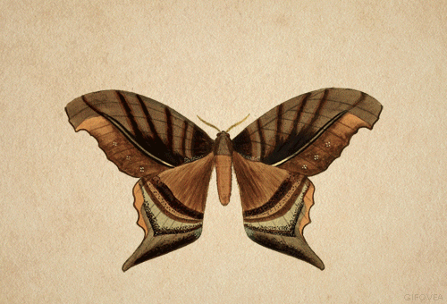
Butterfly & Moth Gif: Artist Unknown
I came across this particular while searching online for some inspiration for my outcomes. Although the artist is unknown i chose to include this GIF because of the ever changing forms of different butterflies and moths it quickly morphs into in a matter of seconds. The sequence moves from one form to another well and loops over and over repeatedly.
The GIF itself is very authentic and natural, with the forms changing sizes, colour and texture to give a sense of movement which is mesmerising to watch and contemplate. It seems to be more of a educational, informative piece than anything to do with obvious narrative.
I have chosen to focus my theme of this project on the second piece of writing that we received called 'Thirteen Hundred Rats'. I have changed this theme from the first one because the second piece of text has driven my inspiration and motivation for the project more so than the last piece of writing did. That being said, i feel that the past outcomes i made still can fit into this piece of writing that i will visually adapt.

'Thirteen Hundred Rats'
To begin looking into this piece of writing with a deeper understanding and knowledge, I have dissected key points within the narrative and broken them down into sections that i can quickly look at and visually and narratively experiment with. I've taken the idea from the last unit i did in BA2a by placing key points into appropriate sections such as Place, Character and Object. This helps me to quickly and effectively see and investigate what I want to explore to create outcomes and developments for this project as well as research,
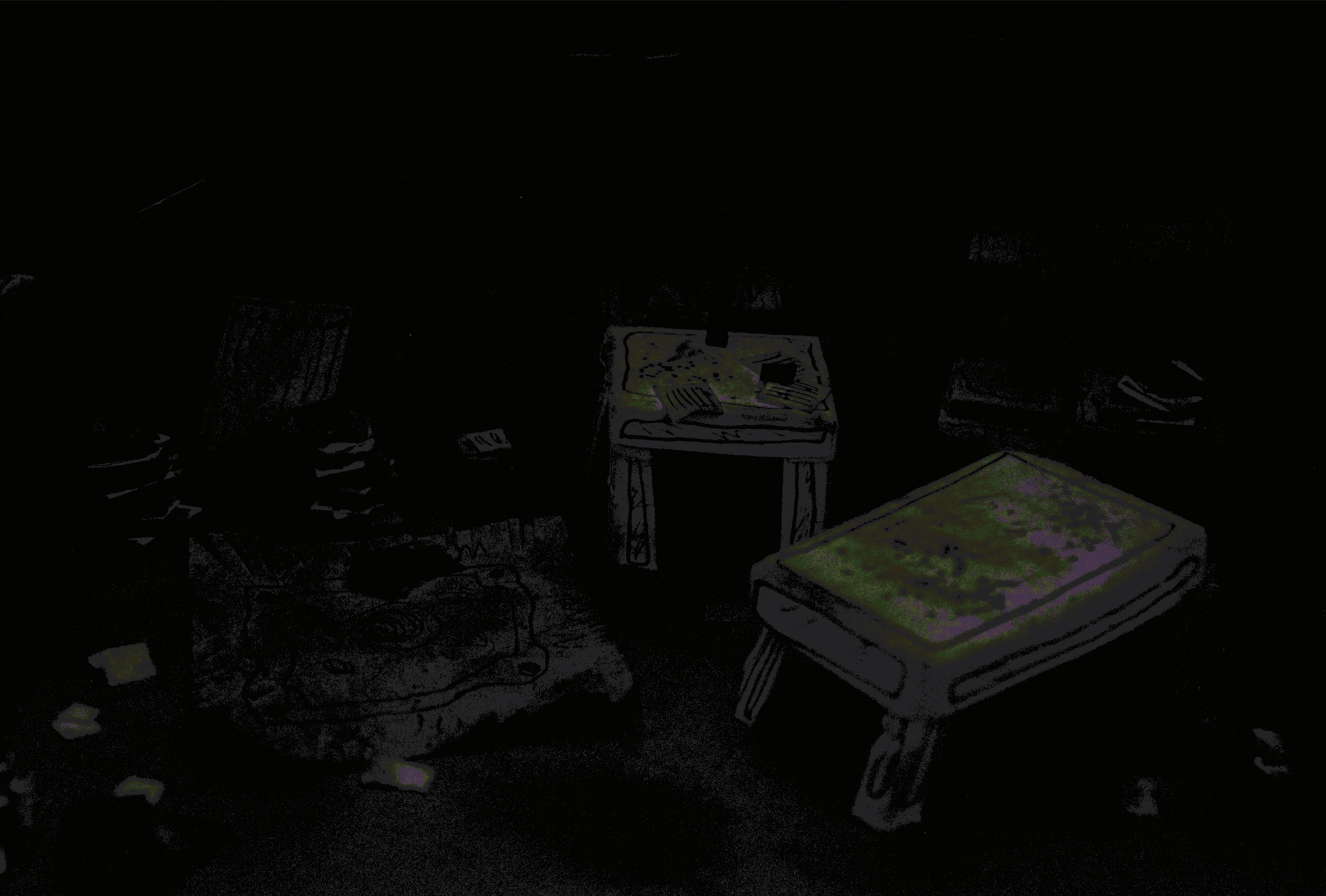
Gerard's Living Room
I have had another go with model making as i enjoyed it very much when we made quick ones in our workshop surrounding the piece of writing 'Thirteen Hundred Rats' which i am now basing my theme off of. This model making experience has been a bit different because i have had more time to produce a whole room out of found materials around my house so i have been open to experiment with more ways of making and building 3D models.

Unlike the group workshop where we worked together to visually create a extract from the story, i chose to make the whole of the main characters living room after it has slowly been over taken by rats and has gone into disrepair.
This room has been inspired by what a hoarders house might look like if it was left. the piles of newspaper, magazines and dirty surroundings illustrate this narrative which fits into the piece of writing.
Making this took a while but i wanted to experiment and develop further my skills within model making with found materials that i had including paper, fabric and fluff. I feel that i kept to the breif in the sense that i used 3 main colours in this model. Those colours are green, white and brown.


When i completed my model i made, i took close up photographs on it and played around with the idea of light and perspective inside the room itself and how this can manipulate what the room can look like.
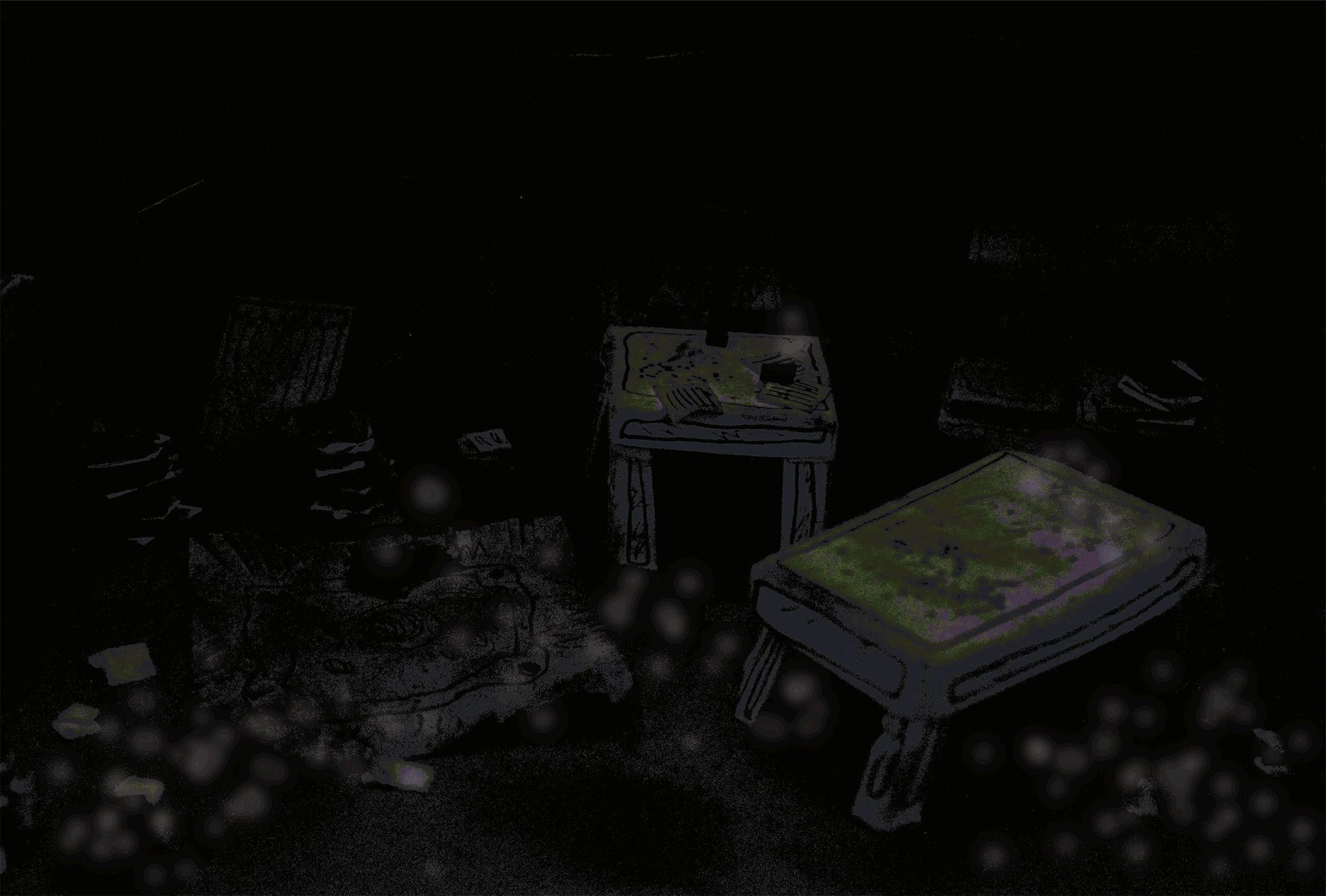
Birds Eye View 1:
The first image from the gallery above is a birds eye view perspective of the model i made of Gerard's living room from the story. Gerard is the main character from the story who, when his wife dies he gradually buys a few rats, and once they multiply, over take his house as he turns it into disrepair.
I wanted to take a snippet from the story where the narrator looks into one of the rooms of the house before entering with his torch and finds the room in this state. To do this i cast a light from my torch on and angle and into the room, creating areas of light that give the illusion of a torch being cast through the outside and into the room through the window itself.
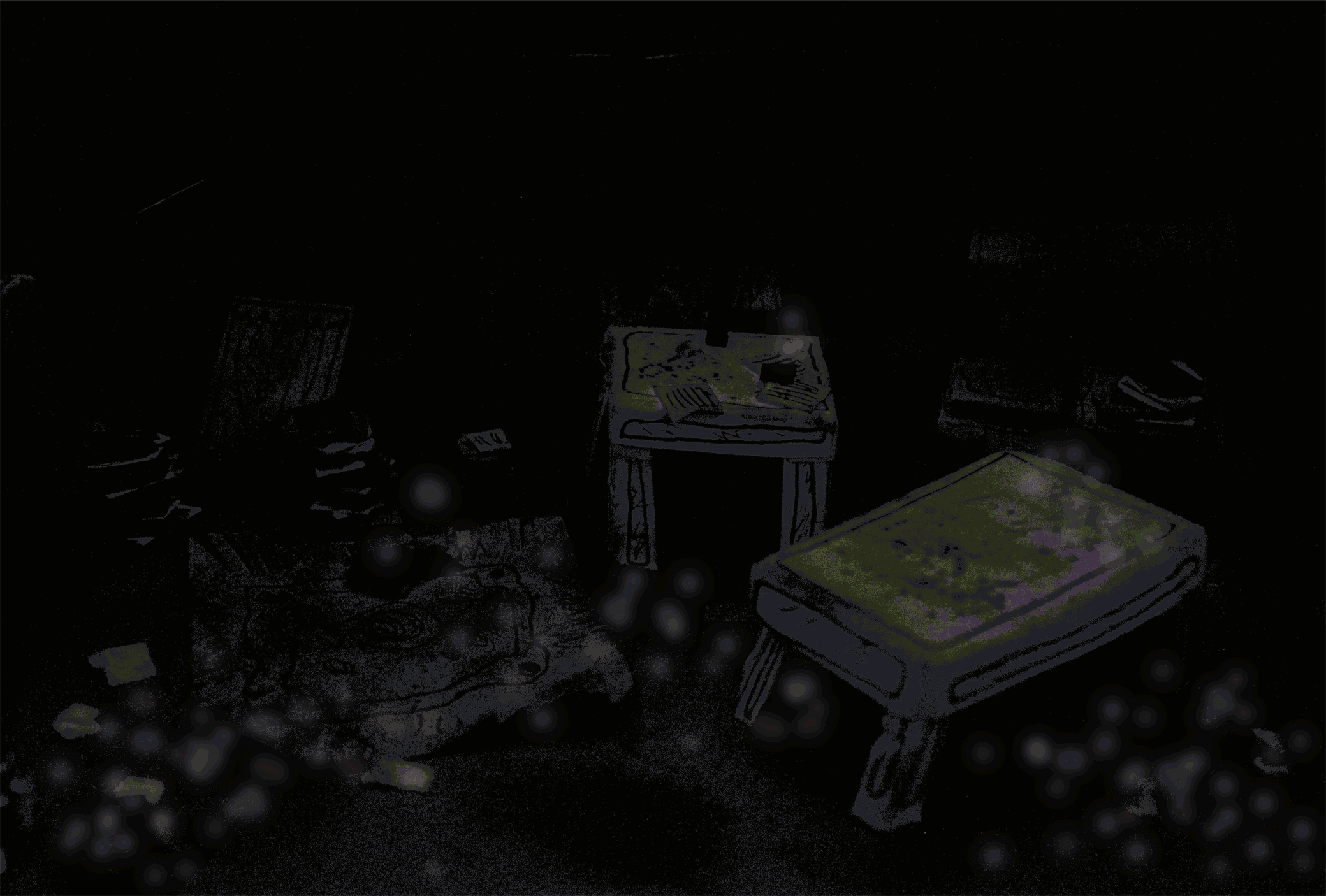
Birds Eye View 2:
The second photograph is very similar but just a light cast into both of the windows from the outside instead of one. For these two photographs, i edited them slightly on Photoshop so that i could concentrate on editing the colours. The model itself is realistic but it has elements of the 3 main colours which are green, white and browns. I feel that the first bird eye view photograph showed more of these colours than the first, certainly with the amount of light and the way it has been composed and distributed through the model.
Living Room Close up 1:
A close up of the living room, focusing on the rat forms that are situated in and around certain mini models that would typically fill a modern living room. Here you can see the details of the green distressed ink that i used to give the model a sense of abandonment.
Living Room First Person View
This view of the living room shows off the whole space within the model as if you are looking at it for yourself as one of the characters.
Newspapers & Magazines:
This photograph has got to be one of my favourites out of this series showing the living room because of the way the newspapers and magazines look realistic and the angle they have been taken. The story itself speaks about how the room was filled with newspapers like these so i wanted to mimic what the room would look like from someone that would typically hoard newspapers and magazines.
Rat Close Up
Another one of my favourites from the photograph i have taken because it is a macro image of one of the rats that are situated in the living room. The light that is pouring in really captures the feel as if someone is outside, looking in and catching the form of the rat itself before it scurries off into the dark again. I feel this image really captures that.
Model Making GIF Animation Draft
Since making my first initial model, i have produced another one which is based more on materials and the 3 colours but still having the same form and general elements of the last model i produced. This model is slightly larger than the last and is made just using glue and paper folded and stuck in different ways. I have chosen paper because its easy to manipulate, comes in a vary of colours, textures and so that the model has a somewhat fragility about it, just like the owner of the rats, Gerard after his wife died.
One of my final outcomes for this project is to make a looping GIF animation so i thought about combining the 3D and 2D aspect into one form to create a model made animated gif, I love working with 2D but would like to experiment and see how i can manipulate both techniques so that they work together. If this doesnt turn out how i have planned the i will continue to experiment in model made techniques and sequences.
So far my model experiments have been centred around a part of the story where the narrator walks into find all the rats that have taken over the house of Gerard's. all 13 hundred of them. I feel that the photographs that i took from the first model experiment have helped me to figure out how i want this animation to work visually.
In terms of colour i am basing the theme of 3 colours that will have slightly different shades. This is to suggest light, shadow, depth and tone.
The idea for this animation was to create a GIF that is focused on the form of the room itself and the perspective that the light brings into it as it passes by. I created the model again by hand and using minimal materials and colours (green/white and grey) The camera stays still on the room and as the light passes through the windows of the room, it lights up different parts of it, which will also show the rats forms which will run around chaotically as the light passes to one side to the other. eventually out of the broken windows.
The first GIF i made above is a draft version where i have played around with the travel sequence of the light passing through the windows. This has worked reasonably well as a first draft but i need to keep the camera in place a bit better than i did for this as you can slightly see the composition shift. I do not have a tripod on me at the moment so i may have to improvise.
The sequence of the light passing could also be improved with possibly more frames that are added to give more fluency to its travel. I will be adding the rat forms into the piece by adding them digitally although i do not know how this outcome will work out or if it will be appropriate and fit into the model nicely visually.

The second GIF draft animation i have made, i digitally put white circles into the sequence that represent that white rats that spill out from the decayed house into the outdoors and surrounding countryside.
I did this experiment more to see how well the digially forms of the rats would look against the 3D life model i made. I think these both work quite well as the lightness of the rats travel and move when the light is against them, This is what i wanted to achieve, although i think this could be done more naturally and easily with real models of rats and it will make the viewer see them more realistically as these rats are quite abstract.. I will try this for my next experiment.

This third experiment is exactly the same as the second, except that i looped the sequence backwards so that the rats look as if they are going back into the house after the light has gone past and back in again. I think this fits nicely with the narrative of the story as it is centred around the rats taking this house into their own home and using it as a haven to breed.
General Research On Rats

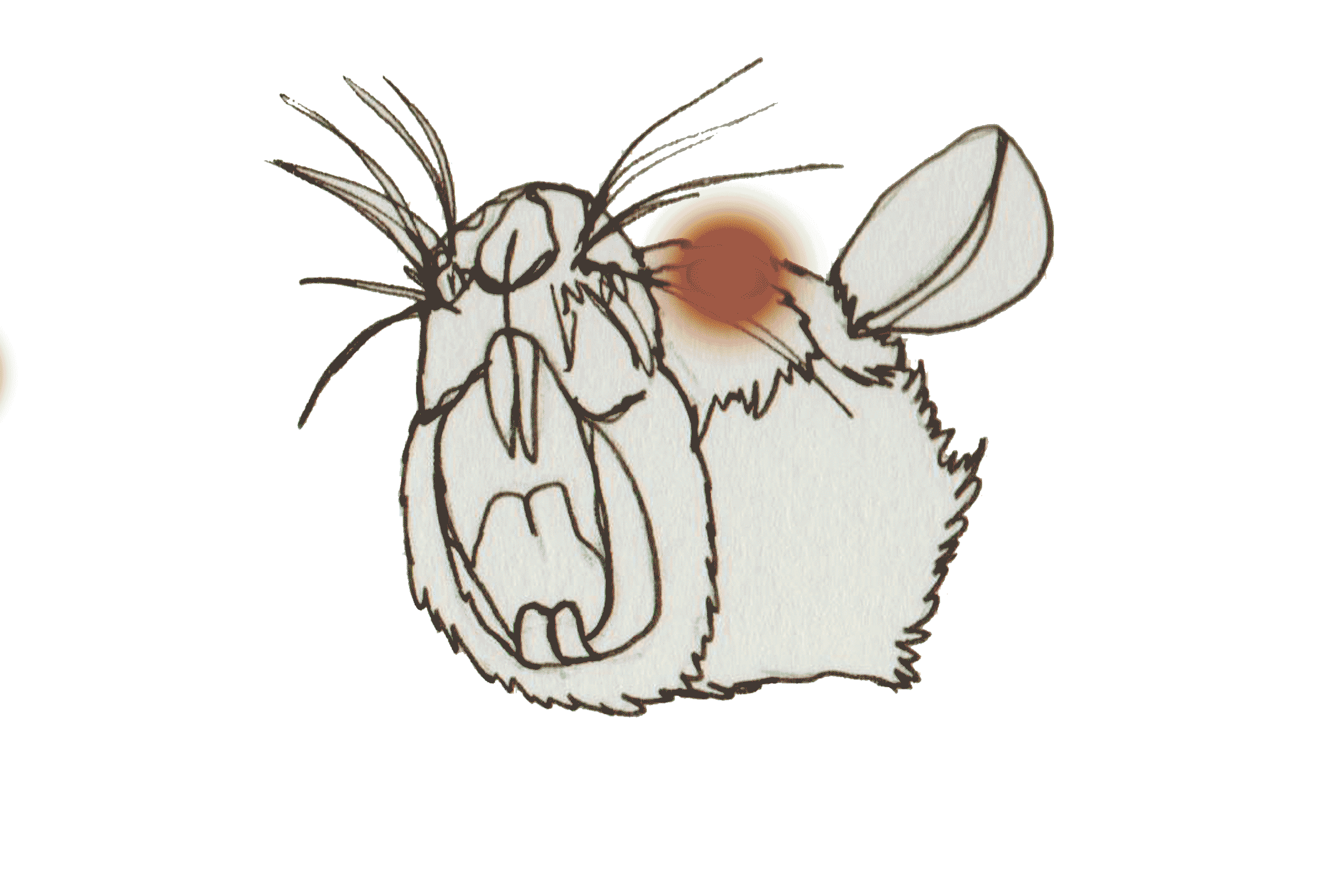
My next sketches have focused on the inside anatomy skeleton of a rat itself, these two illustrations are different close ups of the face.
I really like these illustrations because of the way they are focused on parts of the skull which gives them a sense of being abstract and that they are both symmetrical so they have a focal point situated on their patterns.
The image on the right has been coloured with 3 main colours as this brief is narrowed down to 3 different colours. These colours are random as they are an experiment but i wanted to see how i could bring out definition and texture of the skull through the use of the coloured pencils.
I chose to the anatomy of the rat because they used to be known to be the animals that were at the fault of the plague and since are known to be bringers of death and decay.
Rats are medium sized, long tailed rodents. "True Rats" are members of the genus Rattus, the most important of which humans are the known as the Black Rat. Wild rats are thought to live only about a year or so due to predators.
Rats are usually distinguished from mice by their size. True rats orientated in Asia and spread all over the world. A litter of small young rats are known as a mischief. These species are opportunistic survivors who often live near or with humans in urban areas all over the world. Wild rodens such as rats carry also diseases, including the disease that caused the Black Death.
The the UK we have 2 different types of rat that are not native. These are the black rat and brown. The UK alone is home to a population of 15 million rats. Its estimated that rodents such as rats are responsible for the depleting food supply each year. Rats communicate by marking their territory with urine which goes everywhere. the annual financial cost of ruined and spoiled food from rats is estimated at £11 billion.
Although rats are seen to be dirty pests they have had a good impact on the wildlife of other animals that hunt them such as barn owls and foxes. They also effectively deal with waste that humans leave behind.
Rat King is a term for a number of rats whose tails have been intertwined and bound together by one of possible mechanisms, such as entangling material like hair or sticky substances like gum and sap. The number of rats that are caught in this can vary from a few to 30.
Rat Infestations.
Rats are responsible for the transmission of many varied diseases. Their feeding habits are destructive and their nesting behaviours can be dangerous for buildings and homes. This can hard to diagnose as rats are elusive and secretive.
The most obvious sign of a infestation is of the presence of dead and living rats themselves. When space for a infestation of rats becomes cramped, then they will come out of hiding more often. Another clear sign of a infestation is rat droppings and grease marks along floor boards and walls. Subtle signs are of gnawed furniture, structural damage and large holes in parts of the house.
In the event of a infestation, pest control professionals are usually called to deal and manage the situation. They use methods such as traps, bait and rat poisons.
Rats In Different Cultures
I history, the rat plays various roles in different cultures and are deeply rooted in peoples minds.
Symbolising Strong Vitality: The rat symbolises this in many cultures. This is because that they have a strong reproduction capacity with a high survival rate.
Intelligence: The rat is timid, suspicious and alert with a acute sense of smell.
Ancient worship used to use the rat as a sacrifice and pray to it for success and prosperity.
Rats In Dreams Interpretations:
1. If you dream of many muskrats, difficulties and misfortune are near.
2. If you dream about a rat, you could have many enemies.
3. If married women dream of house rats in their hands, they are going to have a baby.
4. If you dream of pursuing a rat, you will make friends with those who are dishonest.
5. If you dream of catching a rat, you will suffer treacherous plots planned by others.
6. If you dream of a cat catching a rat, you will be blessed because your enemies will be weakened from killing each other.
7. If you dream about dead rats, you will be lucky.
8. If you dream of many rats, you will continually fail.
9. If you dream about rats digging holes in your bedroom or about rats biting themselves, you can escape from disasters.
10. If a doctor dreams about a rat, he will find a communicable disease within his community.
Spot Illustrations Developments and Experiments.
Artist Unknown:
The artist for this GIF is unknown but i chose to include this animation because it is a stop motion technique used to move the forms to make it look as if they are moving across the screen. The sequence flows well but could be better if it is possibly looped backwards so it looks as if it never ends.


These spot illustrations are developmental drawings from my first initial sketches of close up rat images that i drew on brown paper. The project outcomes are based on three colours so i am going to have my 3 separate images as 3 colours. The forms below are close uip anatomical images of a rat skull at various compositions and angles. This is because i wanted to show the in depth form of the skull and make the natural patterns of the skull noticeable. The theme of the rat skulls relates to Thirteen Hundred Rats where the rats have become so abundant that they start to become cannibalistic and kill each other due to malnutrition and cruelty.
I chose to work with watercolours because the colours are vibrant, primary and the medium is easy to work with to create shading and tone in the illustrations. I will develop these images further by editing them on Adobe Photoshop as i want to bring more texture and added colour to the pieces as they are each separate at the moment. Each illustration is a close up of a areas of the skull and the the paper has been cut around it as if it is looking down from the top of a box or screen. I think the paper cut out and stuck onto a background gives a sense of a 3D dimension for the illustration to pop out from the paper.

After i scanned in the first image of the purple rat skull, i edited it into Photoshop and added in newspaper textures that are situated around the form of the skull itself. The newspaper on this image has just been placed onto the form in random areas. I did this because i wanted to see how the image would look with newspaper covering random areas. I dont really like the outcome of this because i feel it looks a bit too busy and want to control where the texture of the newspaper will go.

This second development is the same image but the layout and composition of the newspaper has changed where i have blended various newspaper textures into only the dark areas of the skull. Blending the newspaper into the texture of the watercolour really works well because it gives a sense of added depth, lightness and darkness into the work.
The newspaper also signify's the story from Thirteen Hundred Rats where the home has been overtaken with rubbish, newspaper and paper materials in which the rats live in.
This is more towards what i want to see for my series for final spot illustrations so this could be a possibility as a final piece.
Colour Combinations
Using watercolours i have put together as range of varied colour combinations that i think will contrast and work well together in. Painting them in vibrant watercolours has also helped me to visually imagine what each colour combination would look like together as a set rather than separately.
Natural earthy colours such as dark purple, red and yellow work together as they contrast and have a mix of warm and cold colour that can suggest light and darkness.
In terms of the differences in colour, in my opinion i believe that colours such as green and yellow are different but different shades of the same colour still count as being in the same wheel, just at different light and darkness.
Its quite hard to think of using colours in a minimal way for me because i am used to using a whole range of colours in my working practice but its fun and use colour in a different way to how i usually would.
Lino Prints Outcomes:
I created 3 lino outcomes that are are focused on a section of one of the rat skulls from a previous drawing. These have a gradient of green and yellow together with white as the background. I did 3 prints on thick cartridge paper where the colour has changed slightly through each print.
I like this way of working but i dont think this medium and technique will be suitable for the type of drawing i want to give to my audience as its more abstract than i want as i want to show more detail and mroe sense of form within the structure of the drawings.
Exhibition Event Planning
As a year, we all have a exhibition event where we will showcase our final works for this uni. We are to also create a event that can be focused around a performance, discussion, workshop or screening. It is focused around the contemporary use of a exhibition as a event and the gallery as a work space.
Myself and my group will explore how systems of curation, display, programming and promotion can capitalise on the constraint of a single day.
To start off the event, i have been selected into a group of others from my variations rats group. I am quite happy with my group as everyone seems friendly but a bit quiet. There needed to be a curator for the group who will help plan the event structure itself with a team of 15 from the other groups to work together. I volunteered to do this job as i haven't put myself forward in this way yet so this experience will help me to learn more about organising and more skills in having more responsibility and leadership.
With this job, i feel as though i have gained the leadership role in this group through being part of the curation team. This will be challenging as i am not a natural leader but i feel that i should take myself out of my comfort zone and experience this role more.
Thursday (5 Days before event)
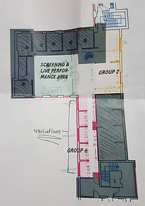
This is has been the first day i have met with my group as it was not possible for us to meet before this day. During the morning i first visited Dove St Studios with the curation team and lecturers so that they could introduce us to the space we are working with for the event.


I really love the space that we have to work with, especially that i is separated into two flights of stairs for a exhibition and work space that can be put together as one for a event. After seeing and experiencing the space for a while, i went back to my group with the images that i took. At this time we didn't have a image of what our works pace or exhibit areas could look like because we hadn't started creating it due to availability but myself seeing the space and showing the images to my peers, we could work around the imagination of the space that we have been given for the exhibition.
Once back at university i met up with my group in the studio and we discussed our ideas what we could create for our workshop. We created a spider diagram as this is a good way to visually write down the first ideas that come to our head. Below is a refined version of the diagram of ideas.
Rat B1 Workshop
Interaction
Audience
Participation
Engaging
Looking
Touching
Listening
Reading
Drawing
Sketching
Sketching
Mark Making
Image Making
Continuous Line
Opposite Hand
Texture/Pattern
Dot Work
Objects
Film
Colour
Images
Text/Type
Concept
Colour
Images
Rat Narrative
Facts On Rats
Experimenting With Materials
& Processes Of Image Making
Materials
Paper
Pens/Pencils/Paint
Glue/Scissors

Watercolour Pencil Outcome:
Again, i have focused on the three colours of yellow, green and aimed on bringing a sense of light and darkness that contour around the skull itself. I really like this outcome but i did not like working with watercolours due to lack of experience in working with them. I will look at working with watercolour paints instead and see if the outcome will be improved.


Wallpaper Sheets
Once we made an initial spider diagram of all of our ideas, we worked together to figure out what would be appropriate and suitable for our workshop that relates to our narrative on rats.
We decided to narrow down our idea of the workshop into a timed collaborative drawing exercise where the participants come together to create images that relate to the narrative of rats using different ways of mark making and using a range of materials.
Our first thought about having the participants drawing was on a sheet on the wall but we decided it would be more appropriate to have people be situated around a large table as this will give more surface areas where people could draw and also allow for more people to gather around it.
Another idea that we changed was the use of 3 colours, instead we have chosen to stick with one colour in various shades. Pink links into the 'Man Vs Rat' Article where the use of pink contraceptives for rats has been used so this is why we have decided on this colour.
Discussing our idea and concept took a couple hours as we needed to have materials and the contemplation of print for our exhibition piece as well as the event. We also had to fill our a proposal form that briefly explains the concept, outcome, space and roles of each person. We filled it out on paper and that evening i typed it out on the computer and sent it off online. Below are some points for our workshop and how it will work as an event.
-
Image Making workshop relating to rats.
-
Concept focuses on different ways of image making using materials and processes provided.
-
People gather around table and draw images on large sheets of wallpaper paper with video prompts on projector that show text and imagery to give subtle ideas and inspiration.
-
every 4 minutes, different themes will show up as prompts to draw. Character, place, pattern, object and action.
-
Spokesperson will guide participants on how to draw between each drawing theme (e. g. opposite hand, continuous line)
-
At the end of the drawing session, the paper will be filled with pink images.
-
Group then cut out roughly A5 cut outs of the collaborative drawings and stick them into pamphlets that the participants go away with. .There will also be a Instagram page where the participants can look at. (#PinkRatTales)
Keywords as Prompts
Fast Paced
Close Eyes
Display On Wall

I met up with the curation tea again in the late afternoon and we discussed the plan for the venue space itself and things needed done. The photograph on the right is of some of the notes i made during this time.
Having all these different things to do for the event itself wasn't intimidating at all for me but more interesting to see in more depth how to plan and put together components for a event like this.
Along with the notes i took, i also came away with diagrams of the event space and the general idea of how it will be set out. I really like the idea of having the event space upstairs and the exhibition downstairs as it will be more of a chilled, discussion area.

On social media after i came back from uni, i confirmed with everyone in my group about what we needed to do next before meeting up again to develop our concept. I feel everyone was happy with our idea and were happy to go ahead and spread out different tasks for each person to do so that we can keep to the schedule. The PDF document is our proposal document that we sent to the lecturers.
Below are inital sketches that i made relating to the article itself and other themes generally relating to rats. These sketches are the first images that come to my head when i think of rats. These are also helpful for future developments and research for more of my work i this project.


These sketches are initial sketches that i did at home as i missed the first workshop that was about image making sketches from the text that we got given to us.
At another workshop i showed this to other groups and the feedback i got was positive and others seemed to really like the blue rats that were drawn to be placed in different lab cages,

Final Spot Illustrations


Below are my three final spot illustrations before there sizes have been changed. The colours are 3 different colours done in watercolours and the newspaper texture has been digitally placed in shaded dark areas to give a sense of depth to the pieces of work.


Final Sized Pieces:
On the right is all of the pieces of different sized spot illustrations. All of the spit illustrations are roughly the same shape and form but all fit really nicely and appropriately into the sizes they have been manipulated into.
All three work really well as spot illustrations because they are different parts of the rat skull but in different angles and compositions.
I really am happy with these outcomes as they are not just visually pleasing but are related to the theme of 'Thirteen Hundred Rats' and rats generally.
The skulls are gathered around the idea of rat infestations and how if big rat infestations are present in homes, the rats over take the home of someone and from the lack of nutrition and presence of cannibalism, rats can die and decay in the homes themselves.
The grungyness of the newspaper texture also signify this idea with the state of the home that Gerard leaves his in as his rats infestate his house in Thirteen Hundred Rats.
Because the colours were limited to 3, i concentrated on contrasting colour that relate to decay, illness and dirt. the composition are close up shows of the skull so it isnt too obvious to what animal it is fom. The corners and sides are faded out slightly so it looks as if the skull has been found in a box and is in a contrast to the shape of the box border itself.


Exhibition Final Spot Illustrations
Our exhibition event at Dove St Studios will have 1 illustration each from our work. We chose to go with spot illustration which are 50x200 milimeters together in pink so it relates to our workshop event and also links together as a collaborative group work too.
I didn't know which spot illustration to go with so i edited them all in pink so looking at them all could be easier to visualise what would visually look best.
I chose to go with the illustration at the bottom with the side view of the skull because it is a interesting composition where it is a close up shot of the skull.

GIF Animation For Exhibition
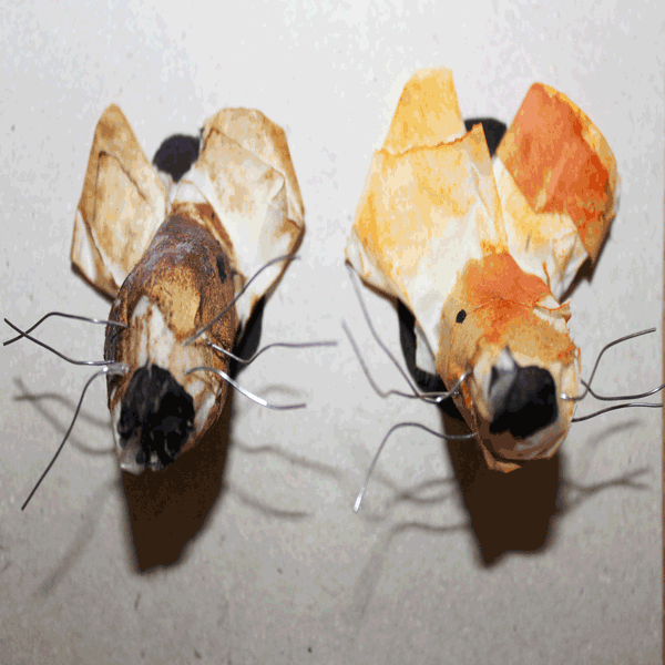
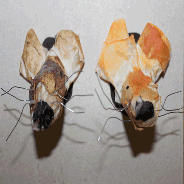
For the exhibition at Dove St Studios, i had to submit one of my GIF animations that i made. I wanted to originally submit my model of the living room with the rats swarming out the door but unfortunately Photoshop crashed upon saving the file as a GIF. I didn't have time to make the sequence again due to the time of the submit deadline, so i decided to use one of my practice models to animate. That way i could still animate and work with something that is 3D using a stop motion technique.
The models are of two rats that have had their heads stuck in a hole. I animated their whiskers to move around and seem as though they are dancing in unison. I lastly edited the animation a bit more and bring some colour into it by hinting colours of bright pink and blue to be more visually pleasing to the audience at the exhibition.
I love the fluency of the sequence but for some reason the coloured rat animation doesn't seem to flow between the end and start of the sequence that well. I do not know why this was but i am still happy with the outcome.
Final GIF animation
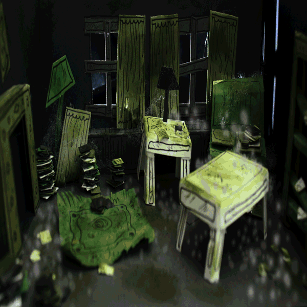
On the right is my final GIF animation which is a mix between 2D and 3D stop motion animation. The model itself is my interpretation of how Gerard's living room would look like based on the text from 'Thirteen Hundred Rats'.
This final animation is similer to my developed piece as it is the same model but i have improved with the sequence of the frames to make the animation more believable and fluent.
The white dots represent rats that are running around and out of the room through the window when light is going into the room itself. I wanted to create real models of rats themselves but this would have been time consuming and other tasks i had to do before deadline. Dispite this, i feel the abstract dots representing rats really work well with the 3D model and i like how they have this round abstract form to them so its not too obvious to what they are.
I used a torch on my phone and frame by frame, took photographs of the light travelling around the room. This was fun to do but challenging as i didn't have a tripod to keep the camera steady but i managed to find ways to work around this by having the camera leant on books. Although some frames are not perfect, i feel it adds to the chaotic atmosphere in the animation, although the camera itself has been knocked by rats.
The model itself was made with minimal colour. These colours are green, white and grey to represent decay and boniness that the owner of the house has after his wife passed away in the story. The animation loops back and forth of the rats running out as the light passes the room, and coming bak in when it passes back.
I have never worked with animation before, especially stop motion animation but i think i have made a good outcome following the experiments and developments from previous animations in this project. It perfectly narrates the story of 'Thirteen Hundred Rats' when the characters walk into the house only to find thousands of rats and the theme of rat infestations.
The Research Of Minimal Colour
& Full Page Illustrations

Firewatch Poster Artwork:
Firewatch is a video game based on minimal colour throughout different scenes in the game. This can be seen through the game poster which is concentrated on different shades of purple and red throughout the poster in a vector appearance gradient. I really love how the background and foreground are seen as gradients throughout the piece of work and how the colour of the illustration brings a atmosphere of curiosity.

Tatsuro Kiuchi:
Ive seen this piece floating around on Pinterest a few times and ive always be attracted to how simple it is in colour and composition. I also love the negative space that has been used to take up the full page and maximise the space that signifies the whales closure.
The colour palette is neutral with minimal colour but suits the concept and atmosphere perfectly. The medium used has a roughness about it through the grainy bits of white showing through the grey that really give the piece more body and a break up from the strong grey colour.

Artist Unknown:
This is a poster for the film, The Jungle Book. The minimal colour used are different shades of blue and green. The image is also a strong full page illustration that has backgroud themes.
I like how you can really have a sense of the scene and what is unfolding in it. The colour brings depth a sense of mystery and curiosity to the piece which allows the viewer to look deeply into the detailed illustration.
I have further researched and looked at different artists and illustrators that have produced full page and minimal colour illustrations because i feel that i need that bit more inspiration when it comes to looking at full page illustrations as this is something i am not comfortable in. My work usually is made up on spot illustrations with no backgrounds so i find that this will be a challenge on top of using minimal colour. Saying this i want to create something that is more relatable to my working practice with keeping detail bur want to have more experience in working with full pages and less colour palettes.
More Exhibition Event Planning


This morning consisted of another curation group meeting where we discussed our proposals that we sent out online to the lecturers. I was also given the task to write out blurbs for the exhibition and event spaces for our groups work.
We were also given a brief for the weekend to have all the sketchbook sketches done for the table at the exhibition which will display developments and experiments leading up to our final pieces. I really liked this touch of including developing work as well as final outcomes.
My group and myself requested for us to have a projector to have for the video prompts during our event but we were told that we were getting a tv to use. I was happy with this because as the video is running prompts all throughout the workshop, we need something that is good quality and clear visually.
The photographs are above of us working in the afternoon to do a test run of our workshop. We laid a large sheet of paper over the table and brought in some gathered materials to use. The video wasn't ready at this point so we just worked on a timed stopwatch on my phone every 4 minutes indicating each different theme,
Doing this made us realise how important it was to have the video prompts for the workshop on the day as it was hard to think up themes with no text or imagery to go on. 4 minutes for each theme was the right amount of time to draw too as it wasn't too slow and gave time to think about what to draw within these categories.
We then all had our prints that we wanted to use for the exhibition on a memory stick that half of the group asembled together on the computer and printed on in A3 Landscape. We previously discussed that we wanted them to be the long 50x200 mm sizes together as they will work together if they are unison.
I told that group that over the weekend it would be good to have the pamphlet, stickers and video done for the workshop so we do not have to rush completing it and too have materials such as boxes and other drawing mediums ready for Monday.
That evening i worked on the blurb for the event and exhibition space for our spaces in Dove St Studios. I then sent this to Peter. The description of both the blurbs are as follows:
Event:
This fun workshop is about approaching image making in a different way by experimenting with a range of materials and processes to create quick images. These images will be based on the theme of rats in response to our visual video prompts.
Exhibition:
Our work has been about experimenting with unconventional, subtle ideas and imagery relating to texts about the relationship between rats and people that stands apart from the conventional and expected outcomes. The project has been focused around the use of problem solving and creative thinking while producing editorial illustrations.

During the course of the weekend, the pamphlet, stickers, video and sketchbook prints were printed and ready to be used and submitted to various people and spaces at the event.
I used the image on the right as my sketchbook print for the sketchbook/development table that will be at the exhibition space. Its an early initial sketch that i did of a hoard of rats done using the continuous line method. I refined it slightly by adding pink to relate to the final print and workshop.
The sketchbook prints were printed by me at home on A6 linen ivory textured paper. I think the choice of textured paper and the prints really worked well together.
Final Event Plan
The day before the event exhibition we decided to meet up one more time as a group to confirm how our event would work and if we had everything prepared. This was also a day to start bringing equipment and props over to Dove St Studios.For our group this was 2 tables. a board of MDF, materials, cables, audio,The TV and TV stand. We were concerned with how we were going to move the tv from one venue to the next and were quite anxious about moving it even if it was disconnected from the stand.
Before we moved our things we had a last practice run of our workshop but instead of doing it ourselves, I invited 4 people over from other groups to spare 5 minutes to take part in our workshop. Because the participants were pushed for time, i decided to have them draw in 4 minutes with two theme prompts instead of 20 minutes. At this point we also just played the intro to our video prompts which is the title: 'Rat Tales' and imagery of rats. They said that they really liked the whole concept of the workshop and the idea that you get to take away a piece of the collaborative art yourself afterwards. It was nice to have some feedback and gave us confident to stick to our plan without changing anything.


It was really good and rewarding to see every bit of our hard work coming together from nothing into a collaborative strong workshop. The others had finished the pamphlet, sticks and video for the workshop so it really felt as if everyone has come together to make this a success. Georgia was in charge of making the pamphlets, Alice the stickers and Sarsh the video prompts. Below are their pieces of work. Its nice to see how the prompts from the video relate to the info and design of the pamphlet.


Designs by Alice, Andy, Georgia & Sarah.
Exhibition Event Day

Before the exhibition itself opened, we had to come together a bit earlier to bring the TV and stand to the venue. This was quite difficult because it was heavy and complicated to carry, fortunately we got it their safe and sound. We had a few difficulties when setting it up but it really was worth it when the video prompts came on it as it made the colour pop and made our work space stand out with our pink colour scheme, including our pink clothes some of us wore.
Our event was at half 3 so we participated in other workshops. It was really exciting to see our work all come together in the space that we had.


The photographs above are images that were taken during and after the workshop. It was a really good turnout of participants as it was very busy so there was a lot of image making being done. It was nice as well because people could join in when they wanted to and join in with the next prompt that would happen. Because there was a lot of us in our group ourselves we also decided to participate in the event to help people feel more relaxed about drawing and not being conscious about it as we really wanted to give a fun experience to the audience.
The event worked really well and the outcome was fantastic. We briefly explained the idea and concept and people stuck to the rules of the prompts and used the video for inspiration for outcomes. Although it was a last minute decision we decided to include audio of rats making noises to attract more participants and give a sense of atmosphere and place. When the workshop was over, we cut up and gave out our pamphlets with pieces of stuck down collaborative work that the group made together.
Without the use of giving away the pamphlets, i think the workshop would have been not so rewarding because the participants would go away with nothing. It is nice that they can keep a piece of the collaborative work they have made as a group.
The exhibited final pieces are from my groups work which are our spot illustrations on A3 landscape paper. Before the exhibition we placed the illustrations next to each other and worked out the layout that we wanted. The two horizontal ones looked best in the middle to level the pieces out altogether a whole.

My other work was also displayed on the GIF show wheel and my development sketches of my pink rats which were laid out on the creative sketchbook table.
Overall i think we worked really well as a group to achieve what we did in the time that was given. We all came together a group to do different task and did them with efficiently and team work. Although i didn't do much outcome wise, i think i managed the group correctly with managing jobs, delegating, organising and achieving background tasks, for example sending proposals and work for various other curation groups. I have never been a leader in a group like this before and i haven't had the opportunity to be part of the curation team so it was an rewarding experience which has made me feel more confident in my working practice and also personal life. It was also nice to be told that what i was doing was impressive. Not only have i gained confidence in working with a group, ive also learnt new skills relating to curating and delegating a team of people.
Full Page Illustrations

I wanted to base my full page illustration on the sense of place from Thirteen Hundred Rats.My first full page design is based on some initial sketches that i made at the start of the project but based more on the narrative of the story where all the rats pour out of the cottage. On top of the cottage is a large rat or 'King Rat' that is towering over the cottage like a monster to reflect the enormous of threat infestation.
I like this design but i feel that the large rat takes away from the sense of place and location in the piece as its quite distracting, although i like the small rats that are more like forms crawling out of the building. I want to relate the use of medias together in the different illustrations i have made for this project so i plan on working with watercolours and possibly experimenting with shrink plastic which fits nicely into the narrative of rubbish piling up in the house because of the 3D dimension the shrink plastic brings to the design as it turns to thick material.


For my second experimentation and development outcome, i experimented with shrink plastic. Shrink plastic is a material used to make crafts and jewellery out of plastic that shrinks and minimalises the design. I wanted to try this with the cottage from Thirteen Hundred rats so i drew out the design on the plastic, coloured it with pencil and heated it up to shrink it into a small design, The photos on the side show the design that has been turned into plastic. It makes the colour pop and gives the design a new dimension. unfortunately when heating the plastic, it got caught and melted with another part, causing it to bend and warp so i couldn't use it. Looking at it and contemplating its form, i quite like the way that it has been warped as it reflects the narrative of the mess and general chaotic atmosphere of the house, I think if i photographed and digitally edited it on Photoshop it could make a possible final outcome. I may make another shrink plastic experiment and see how it turns out compositionally wise but that will depend on how much longer i have left on this project and the approaching time of the deadline, as this process is quite a long one to make a small plastic design.

I have made a mixed media full page illustration where the cottage has been in watercolour and the rats themselves in shrink plastic. The colours are based on 3 main colours: grey, green and purple. I do not like this outcome as much as both the medias do not fit as well as the shrink plastic rat designs are small and quite saturated compared to the gentle watercolour design of the house itself. I could see what this looks like digally next to see if ican manipulate the saturation and colours a bit more to make them fit.

For my final piece for the full page illustration spread, i wanted to create a sense of place from Thirteen Hundred Rats so i have worked with shrink plastic to create 3D hand drawn piece that also reflects the narrative of the chaotic story and how materials in the home have been ruined by the rats that live in the cottage. Unfortunately i have had to use this photo of previous shink plastic outcome as one of my final pieces as i misplaced the outcome. I could recreate this whole piece again physically but i do not think i have enough time before the deadline as it is quite time consuming.
Saying this, i do like the outcome that it created even though shrink plastic is not supposed to warp and bend like this, i thought this really fit the narrative. I stuck to the 3 main colours that i produced on coloured pencil before shrinking it with heat. These coloured i think work really well because they highlight specific different areas of the image that make up the sense of place and. The purple i like particularly because it makes the rats stand out and gives a sense of cold infestation and almost a zombie hoard feel.