
Summer Project Outcome
For my summer project this year, i was instructed to create a character. This could be from a book, film, fact or fiction.
I chose to produce something that was not seen but rather felt by people from different backgrounds and cultures. Mental disorders and in particular anxiety disorders are very much felt by people who suffer from these problems and i wanted to help visualise what an anxiety character could look like.
I began my research by reading up about symptoms, treatment, types and causes of anxiety in people. I also gathered information based on the fight and flight response that animals and humans experience to help deal with danger. these two subjects linked well as anxiety is a symptom of the response.
Another interesting and facinating subject i came across was about the cordyceps fungus. This fungus is known for infecting insects through digestion and slowly turning them mentally and physically unstable until they eventually die when the fungus grows out of their bodies.
The researched i gathered was enough to give me foundations to start sketching and drawing ideas of what my character could look like. I wanted to create something that was eerie, atmospheric and slightly uncomfortable. almost appearing ghost ike in its demenor.

I am very happy with the outcome of my anxiety character. I feel like it has the right appereance and atmosphere that i visualised when i was creating the final design. Each part of the character holds its own meaning and reason for being. these include:
The Wolf Skull - This is to symbolise fear and paranoia that the victim may feel. only the top jaw and head remains of the skull itself.
Clock - The clock on the forehead of the skull is also symbolising paranoia of time and impending doom.
Eyes - Souless but facisnating and alluring its victim.
Cordyceps - The fungus is seen as a pattern that embosses itself into the skull. it is also seen faintly behind the back of the character where it sways with the breeze and grows as the victims anxiety becomes more consuming.
Wolf Body - Can be seen around the skull of the character. below the chest and lunges the body sinks away into darkness with the clothing its surrounded in.
Clothing - The clothing incases around the body of the character and is based on tribal apperal and the patterns based on the body of a cicada insect. The accessories also are based on tribal clothing.


Above is the inside of the booklet that complimented the character poster. each page shows the anxiety character growing in size and intenisty. the character slowly draining its energy into the victim and in turn growing more consuming.
'Light Is Like Water' Project Brief
This project is about exploring narrative illustration in a publishing context. I will explore and investigate my chosen short story to produce a book cover and inside illustrations.
I have chosen my short story which is called 'Light Is Like Water' During the first read through this story didn't really speak to me. It was more the actual title of the story which sparked my imagination and when i began reading it over and over i gradually become more interested in it as its very open to interpretation and has this sense of childlike imagination and fantasy through that.
When i printed out my copies of the story, i highlighted different areas and annotated sections that interested me. This was too pin point certain sections when characters would talk, locations and objects.


I found that using highlighters to pin point different sections of the story wasn't really working for me as certain points didn't stand out and it took some time to find those areas of interest for me.
I printed out another copy of my chosen story and cut different sections out and put them in their appropriate groups. eg: objects, descriptive words, speech, characters, animals, locations, time and doing words.
Cutting and sticking words together in a jumbled fashion has really helped me to visually and easily find bits of the story. This is because the words easily pop out and it breaks away from being in a paragraph.
I decided to take out random words from the collage type and roughly illustrate them using coloured fineliner pens and the continuous line method. I really like the loose feel that this technique brings because its quick but also playful and simple. I find this refreshing because i am usually very meticulous when i work with fineliners.
'People, Place, Object' Workshop
For my first workshop on this project, I brought into the studio my photocopy & collages of my story text.
For this task I was to create 5 images of a particular subject from the short story i chose. Object seems to connect with me because i feel that inanimate subjects can tell so much about a story and the people & places that are attached to them.
From my gathered text on my pieces of collage, i began to try and draw particular themes that are most appropriate to the story that i am trying to show visually.
The first few sketches that i created are very raw but i think i was trying to hard to make them work with the concept of the layout itself which i find didn't help me visually to create ideas from raw text.
I looked back again at the cut up text with the doodles i created the day before on coloured paper and after some discussion with one of the lecturers, I decided to go back a few steps and loosely sketch each object which is mentioned in the story without overthinking about the composition, appearance and concept but to really gather visual research which may help me further develop the story.

I like the composition idea for this but i feel that the colour of the images themselves are not really feeding into the concept of the story.

This looks more like a layout idea and although i like this concept, I feel i am trying to jump forward a few steps without having foundation images to research and develop on.
I like the composition idea for this but i feel that the colour of the images themselves are not really feeding into the concept of the story.


I think my next step is too join different objects together and see which ones visually work well together as a narrative to the story ive chosen. This could be done by experimenting with scale, composition, number of objects and colour. I will experiment more with significant objects that relate to the story, such as the lightbulb. This object is very relevant and appropriate for the short story as its based on the imagination that the boys create from the bulbs golden light.
Artist Research - Adam Simpson
Adam Simpsons work is a mixture of self initiated projects and commissioned work.
The image on the right is one of Adam Simpsons pieces that has been digitally drawn. The piece itself is called 'Tents' and, annotated on his website, saying 'Celebrating the simple charm of tents'
This piece really has inspired me because it is focusing on the significance of simple objects and placing them in this structured, organised fashion which bring out their individual and subtle differences.

For my project, I would like to focus on a few significant objects that are incorporated into the short story, whether it be a bottle or a boat from the story. I would like to compose these objects in a structured and strict uniformity that collaborate next to one another.
Artist Research - Michael Craig Martin
Sir Michael Craig Martin a conceptual artist and painter. The relationship between object, representation and language are his main themes within his work.
The relationship between the composition, colour and object are what fascinate me most about this artists work as they are all formed with bold outlines, closely composed in or next to each other, and have intense bright flat colours.


This use of composing objects together is what i am looking to achieve for my inside illustrations that will be inside the short story. I like the idea of colouring one significant object and leaving the rest white to give a sense of dominance and further meaning to the coloured object in a simple form.
Penguin Competition 2017
This mornings lecture was a talk on what competitions we could sign up to enter for 2017. I have chosen to do the Penguin Design Competition because it is specifically open to students and has three competitions that you can enter.
Penguin have changed their layout for their books from very distinctive covers to contemporary ranges of art from a range of different styles while still keeping some features from their original books.
I am excited but nervous to participate in this competition because i have never entered a serious competition before so this will be a new experience for me. I am excited to find out what the themes of the competitions will be.
Task 1
Competition Workshop
The Workshop for the afternoon consisted of talking about our books from home that we brought into the studio. In small groups we discussed our reactions to the designs, aesthetically, emotionally and intellectually.

The two books that i chose to bring in were both very different in many ways.
The first one was a fiction book by author, David Clement Davies called The Sight. Its a book that i have read many times so i am very knowledgeable about the narrative and characters.
As a collective group we all decided that the first impression of the book is very mysterious but direct by the way the wolves eyes are drawn to yours as a focal point. the eyes are also the only piece of bright and bold colouring that you get in the cover. the rest is very monotone grey with a feeling of coldness.
There is a strong connection and contrast between the character and layout of text and background in narrative and visual understanding. This makes the viewer interested and curious to find out more about the book.
The back cover itself is quite different from the front cover. the colouring is more of a monotone blue and has the main character standing alone. this shows two different view points of the main character from the front cover design.
the back cover is also very enigmatic and is central according to the text above it.


Another book that i brought in and showed the group was a educational book called Nature Anatomy which is studying the anatomy of plants, planets and animals.
As a group our first impression of the book cover is that its very informative and direct. the type is handwritten text which make it fun, simple and playful.
The illustrations themselves from the cover are also featured inside the book itself. They are sketched by hand and coloured digitally. Again the drawings are very simple yet colourful and bright. The texture of the book is very organic which fits well with the earthly tones of the background.
The back cover also has this same theme of informative and playful subjects framing the text at the back. Another interesting addition to the cover is that on the inside, both the back and front covers flip out to create a bookmark to keep the inside pages fresh and protected while also helping you keep track of where you are within the book.
As a result the book design altogether makes it interesting to find out more about whats inside and what you can learn.
Task 2
Competition Workshop
For the second task i took my name, surname, intials and using different type faces suppiled, i created a self portrait.
While making my self portrait from type faces, i was constantly thinking about how the letters would express my character. I chose to use upper case, lower case and different sized fonts to show my shy and confident side. I used two numbers, 22 to express my age (one being my nose and the other being one of my earrings)
The eyes were quite hard to find a appropriate letter for so i chose to highlight my glasses from the under score marks. these are also placed to highlight where my hair is and the basic shape of my face.
The letters themselves were a mixture of Charlotte, Collins and Lottie.
This exercise was really enjoyable and made me think less anxiously and scared about using text and experimenting with it in a fun and playful way.

'Scene Shift'' Workshop
During this workshop, i learnt about different shifts between scenes in stories. in every story there has to be fundamental themes that happen throughout.
On a worksheet i filled out different qualities of shifting scenes within my short story and made a diagram which reflects the establishing shot, conflict, climax and the denouement.
When sketching out four illustrations that reflect these shifting scenes, i designed the scenes as though you were watching from a distance and can see the whole room around you. This was to help me decide and give myself a picture of where and what these characters could be doing and the objects that are situated and related around them
Because i am focusing my four illustrations on object and place, it was important to me to intergrate appropiate objects within the scenes. I wrote them down on note paper so i could easily pick out words easily and draw them on a seperate page.
I found this task to really help me narrow down what significant objects that i can include in each scene which will tell a narrative and the relationship between object and characters.


Researching 'Place' From Chosen Story
To help me start off my research, I have looked briefly into where my chosen story, 'Light Is Like Water' is set to gain a better understanding of the place.
In the story itself, the author doesn't mention when the story is set so on other themes within the story, (objects) it seems like its set in modern and comtemporary times.
The setting, Paseo De La Castellana seems to be a very elegant, fashionable and modern place to live in Spain so i imagine the apartment that the characters live in with echo this idea.

What Is Magic Realism?

Magic realism is an ongoing theme that relates to my chosen short story, Light Is Like Water because the story is based on the power of a persons imagination and magic realism signifies this in the way certain themes are presented and arranged.
I will develop my work by experimenting ways of how i can bring the illusion of magic realism to my short story and in particular, the front over as it will bring a first perspective of what the book may be about to viewers.
Book Cover Inspiration
From analysing book covers for the Penguin Competition workshop that I took part in a few weeks ago, I have taken that idea and technique of researching and analysing to research other varied artists that have produced book covers that inspire me.
After looking at these covers meticulously, I have come to the conclusion that i want to create a cover that really highlights objects through negative space and possibly the use of repeat pattern processes to bring the focal object out.
As far as creating this, I am not so sure if i should do all of this using traditional methods, especially if i am to create intricate repeat patterns that relate to the theme of beautiful and colourful Spanish tiles.

Emotional Colour Research
As i want to incorporate colour into my illustrations, i have looked into what emotional colour is and examples of it. Because the story is about imagination, I want to include that through colour as well as objects that will engage with the audience.


Significant Objects

Carrying on my experimental work, I am looking into creating my chosen stories narrative with objects. After picking out significant ones that relate well to the story, i have played around composition
The first illustration i drew is centred in the middle of the page with four particular images. The way the images have been manipulated is very interesting as it gives them a formal dimension. the colours are light, playful but could be more fluid to signify water on them.

Here i have incorporated more objects to the design and played around with how many objects i could fit in between the spaces of others. With more experimentation and development, this idea could be a possibility when it comes to making the inside illustrations for the book.
Again i have played around with the positions of the objects to indicate a puzzle or display like layout.
Developmental Experiments for cover
Following my chosen objects that i believe to be significant to the short story i have chosen, I have developmental ideas that will focus around the theme of the lightbulb as one of the main objects.
the lightbulb is a significant object in the story because it is the inspiration for the golden light that floods out and into the rooms of the characters homes where they can use their imagination with the light from the bulb as a source.
Lino Cut: The first design that I have come up with is a very simple use of bold warm and cold colour that gives a sense of mood and atmosphere.
The lightbulb itself has been cut and printed using the Lino cut technique so it keeps to the simple design that i firstly wanted to convey.
Since printing this illustration and analysing it, I decided that the simple design doesn't give too much away to the viewer, its just seen as a light source. I want to give more imaginative information with the idea of magic realism in mind and this image doesn't do that for me.
On the other hand, I do like the contrast of hot(yellow) and cold(blue) colours that work together to bring a light source, background colour and a sense of fun from the bright shades.


Cover Design Development 1: The second idea i have is more on the lines of creating an idea of magic realism to the book cover. The silhouettes are of the two main characters that are in the book with the water pattern that is flowing in and around the characters and objects situated around them. i like this idea of the characters that are integrated into the objects and the symmetrical portrait style of the overall design.
Cover Design Development 2: I have carried on the colour palletee of the first design with the warm and cold colours contrasting well. i have also played around with water pattern ideas to make the water seem light and playful to relate to the children in the book. I will follow up this idea for these reasons but i feel that i need to find a good contrast for the background colour that will show up the other main colours well and bring a mood to the illustration.
i feel the text should now be some kind of formal or playful type form that is situated around the lightbulb with the authors name underneath in a smaller size.
Researching Text Forms

I have experimented with text types to analsye which ones would be most appreciate for my story.
i was originally going to experiment with handwritten type forms that i have created but due to the tight deadline of this, i will use a type form thats formal but clear to see.
I want to work towards matching my book cover and the type forms Ive chosen to bring a sense of playfulness, imagination to create an engaging and full front cover.
The type forms i am most interested in working with are Apple Chancery and Monotype Corsiva as i like the formal but flowing type forms that will relate to the water thats pouring in and around the text in the cover.
The other types seem to be fun and almost in a handwritten style but i feel may seem a bit too sparse and may get lost within the design thats going to be situated around it.
Connecting Title, Text and Image


Guest lecturer, illustrator Graham Rawle presented an workshop that consisted of connecting title, text and image together. Out of a list of muddled and entertaining words, I chose to pick 'Risky Hairstyle' This word connected with me as i can relate to having loud hairstyles and colours so this task was motivating and entertaining to do for me.
In the time that was given, I briefly researched the separate words 'Risky' and 'Hairstyle' to create a theme that relates both together. These are some examples of the meanings and definitions that i came across:
Risky: Unsafe, cause harm, possibility of danger, tricky, high risk, insecure, failure.
Hairstyle: cut, style, length, straight, curly, frizzy, colour, volume, damaged.
Thinking about how people go to extreme lengths to have the perfect hairstyle to fit in, i looked at objects that could relate to 'Risky Hairstyle' and how i could incorporate them into the theme narratively and visually.
Risky objects: scissors, hair straightener, curler, hairspray, hair dryer.
The outcome was based on Artist called Nagi Noda who uses hair to create sculptures of animals that integrate within the hairstyle. I arranged the objects that people use to product their into the actual hairstyle itself so its ironic and entertaining but with a sense of an serious issue of self abuse on ones identity.
Although i didn't complete the illustration, I would like to render and finalise it in the future with text, and shaded colour.

Researching Spanish Tiles
Brief History Of Spanish Tiles:Modern day Spanish tiles range from elaborately decorated and colourful mosaic tiles. The tiles are expensive but are extremely high quality and durable. They range from bathroom, and kitchen ceramic Spanish tiles to wood look tiles which can have a whole range of different finishes on them. The origin of Spanish tiles are modest and stretch back to thousands of years.
Before the invasion of Spain in 711, ceramics had been utilised in just structural design in the form of unglazed bricks, roofing tiles and water channels. The introduction of glazed tiles with metallic oxides was a contribution of Islamic culture. The first European use of these tiles was in Spain and their use spread throughout the western world.
During medieval times, ceramics were widely produced in southern and coastal Spain, such as tiles for decoration and construction as well as earthenware pieces. Great pieces of tile were created for churches and palaces throughout Spain.
The world, in time exported these ceramic tiles when knowledge and styles of ceramics developed in Spain and in turn are now the tiles we see today in modern times where they are used for decoration in bathrooms, kitchens and hallways.


I want to incorporate the theme of ceramic, Spanish tiles into my final book cover illustration for Light Is Like Water. This because tiles, especially elaborate and beautifully intricate Spanish tiles will have a relation between place and object. (Ceramic tiles > Spain > Bathroom > Tap > Water)
The idea visually will be the ceramic, Spanish tiles placed behind the simple light bulb focal point in the central point of the cover, possibly in negative space. The tiles will also have water like patterns with objects subtly incorporated into the pattern.
The difficult part with designing the Spanish tiles will be accuracy in making repeat patterns and that the design will suggest the flow of water in a intricate and symmetrical way that curve around the negative space of the light bulb to suggest its shape as the focal point.


On the left are some inspiration examples of Spanish tiles that i will use to fuel my design process when illustrating and designing a pattern.
I will do the pattern in watercolour so it has a light, fun, childlike mood about it and further relating it to the title and narrative of the story using my medium.
The 3rd ceramic design really visually speaks to me because, while its not symmetrical it is has a sense of flow with flowers incorporating into it. maybe i can do this with appropriate objects relating to the short story.


The images above are some images of wave designs that i found online. This is too give me some idea and inspiration of how i can manipulate the design of the tiles to make them seem more water like to relate to the stroy and theme of water and child like fun.
Book Cover Outcome
Developing from my previous outcomes for my book cover illustration and taking inspiration from traditional Spanish tile designs, i designed a cover which reflects the narrative of the story through the negative spaced light bulb and the water design flowing around it.
Below are multiple outcomes that i edited on Photoshop. I changed the colour balances to give different but subtle differences to the piece. I also manipulated the type and changed around the placements of thr authors name because i didnt know where it would most look suitable.


Outcome 1: This is the original outcome that i had when i finished colouring and shading the illustration itself. The placement of the authors name is something i wasn't to sure of because the colour of the boat shape almost hid it from sight.
Outcome 2: The second outcome has been edited slightly by making it brighter and the authors name has been changed to lay at the bottom of the light bulbs form. I feel this is more central and can be seen easier without taking away from the deign itself. There is also a white light that is coming from the light bulbs shape to emphasise the word 'Water'
Outcome 3: The colour balance has been changed slightly to bring in purple/red tints to the text and some background shapes. This was a accident but i like the outcome and the mixture of cold colours. The placement of the authors name has been changed again to see what it would look like fit was placed in the boat shape with some light subtly making it more obvious to see. I like this outcome but i feel the dark areas could be more brighter and more innocent looking with lighter shades to reflect the innocent life of the boys in the story.
Outcome 4:The forth outcome has had another colour balance effect which brings out more greenish/blue tones to reflect the waters colour. The edges of the illustration have been subtly bordered with a light tint of white to bring more lighter tones out in the image and make the light bulb seem more appealing. Again the authors text placement has been changed back to the central position as it doesn't seem noticeable and readable when it was in the boats shape.

Final Outcome
The above image is of the final outcome of my book cover for 'Light Is Like Water' It has been inspired by the narrative of two young boys who use their imaginations to travel on a river of light in their homes. I wanted to tell this story visually through the objects that are within the narrative itself. The significant objects that were most appropriate to tell the story were mainly household objects that you would find in your home, including a light bulb that flows out water.
Another main theme i wanted to incorporate was the geographical place in which this story is set. To do this i looked into traditional Spanish tiles. Tiles themselves can be found in Spanish homes and hold beautiful intricate designs and are likely found in multiple rooms but mostly in the bathroom.
This link between tiles, bathrooms and water seemed to fit together nicely to the narrative as the tile design suggests a place you would think water would be in a urban place. The design i created has been manipulated to reflect a water like design with flowing droplets dancing around one another, away from the light bulb The tile illustration designs have also been coloured and shaded to reflect the colour of water. Hidden in some tile designs are objects that are also significant to the story but are subtly showed by gazing into the illustration.
The light bulb design has a border of patterned water splashing around it to signify the negative space of the light bulb and the flowing of water that appears when the boys turn on the light in the story. The bulb is also golden to suggest a more obvious area of its form and inviting, rich colour. The gradient light areas of the splashing water are patterned to make an illusion of light and playfulness around the bulb.
The subtle darkness that is bordered around the piece gives a sense of looming negatively and darkness that could be in the room.
The text itself is a formal yet playful type that is central in the placement of the light bulb to suggest its shape and reflect the relationship between the type, image and narrative. The word 'water' has been made bigger to fit better into the shape of the light bulb and suggest the theme of the story.
Childlike Drawings
The children in my chosen short story use their imagination to travel through the house on light with this sense of magic realism. Children use their imagination when they are developing skills from an early age and to experiment with imagination they draw and colour, with age growing in skill and experience in using their motor skills.
With this idea in mind, i will incorporate the scribble like use that children use when they colour in drawings and use a range of mediums like pencils, pens and felt tips to make patterns, images and to also use bold thick pens to draw inside images with bright and bold colours.
The next plan of action is to experiment with my object outcomes and see what mediums and drawing outcomes look narratively and visually appropriate to the short story.


Inside Illustration Developments
I started my developments for the inside illustrations of the short story by still carrying on with the theme of significant objects telling the narrative visually.
With inspiration from my first initial sketches and ideas, i developed my drawings by keeping the simplicity of the form and playing around with colour and a child like state of scribbling over the images.


I scribbled over the images i made using a yellow felt tip pen and formed a simple shape of a light bulb which is the main significant object to the story that i want to carry on to be a lasting heme throughout the cover and inside illustrations of the book. drew the light bulb in a light colour because a dark colour would take away the shape of the other images that are coming through the colour.


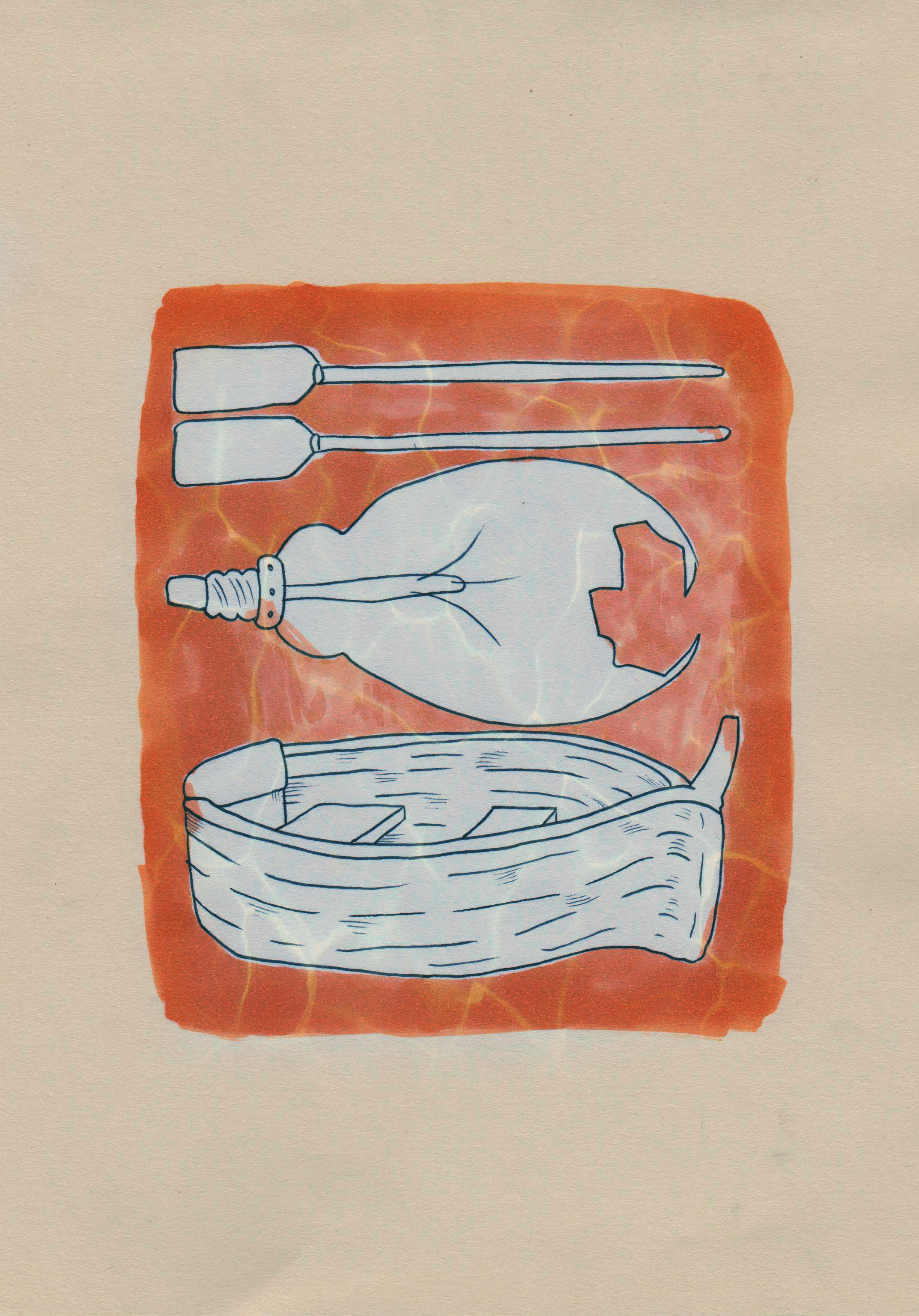
The images above are the second developmental drawings that i produced. I have chosen objects that are most relevant to each different scene/section of the story to bring a better relationship between the text, image and narrative when the audience will read the piece. Each illustration has different washed colours that symbolise different emotions and each design has three images that are composed structurally tight to each other and also significant to the changing story.
For example, The first part of the story is about the boys moving the boat between different rooms of the house so i drew appropriate objects that would relate to this scene. The colour is a yellow which emotionally symbolises confidence and creativity which the young brothers have in the story when they are convincing their parents to move the boat to different places within the house.
The second image represents the scene in which the boys used diving masks to swim about the living room of their house when their parents were out. The colour has changed slightly from a golden yellow to a pastel orange which symbolises the optimisation and imagination that the boys have while exploring the room.
The third image has turned its colour to a reddish blue which symbolises the looming danger and sadness that happens. The images are reflecting the scene where, again the boys have broken a light bulb to again swim like sharks in their diving suits around the house.
The last image represents the ending when the boys were searching for the light house amongst the flooded house with their classmates that joined them when swimming on the light. The colour relates to the sick and cold mood you get when reading the sad end to the story.
Thoughts: my thoughts on these developments are good because i feel i have related the objects well to the story and the emotion of colour that runs through. I am not so happy with the visual outcomes as far as the mediums i have chosen have gone. I want to make the colours look more bolder and almost set out like a colouring book which children find imagination in and creativity. This idea can relate to the boys own imagination when they are swimming on the light.
Final Inside Illustrations

These are the final inside illustrations for my short story, 'Light Is Like Water'. I kept the theme of child like scribbling around the outside of the images and changed the medium from watercolours to felt tip pens to bring out ore vibrant and bold colours.I really like the water the pen has made area have a dabbled appearance. I have deliberately drawn over the lines of the objects in colour pen to show a light scribbled effect which is designed as if the children themselves are trying to draw around the images. I think if the coloured pens went over more of the objects then it would take away the form of them which i want to show because each object has meaning and correspondence to the narrative of the story. I overlayed the images digitally on Photoshop and added some water like textures to bring a sense of playfulness that relates to the book cover illustration and the narrative.
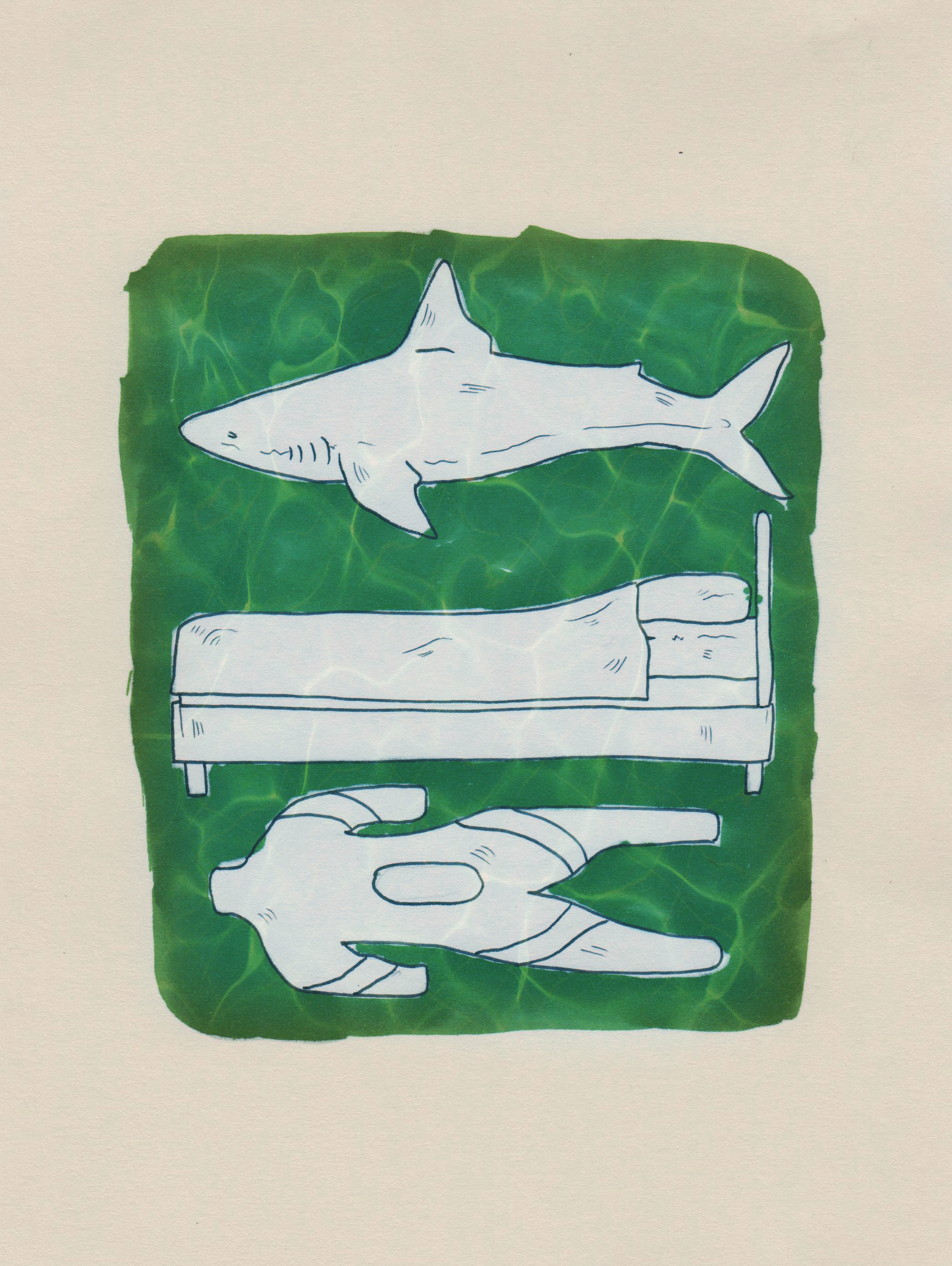
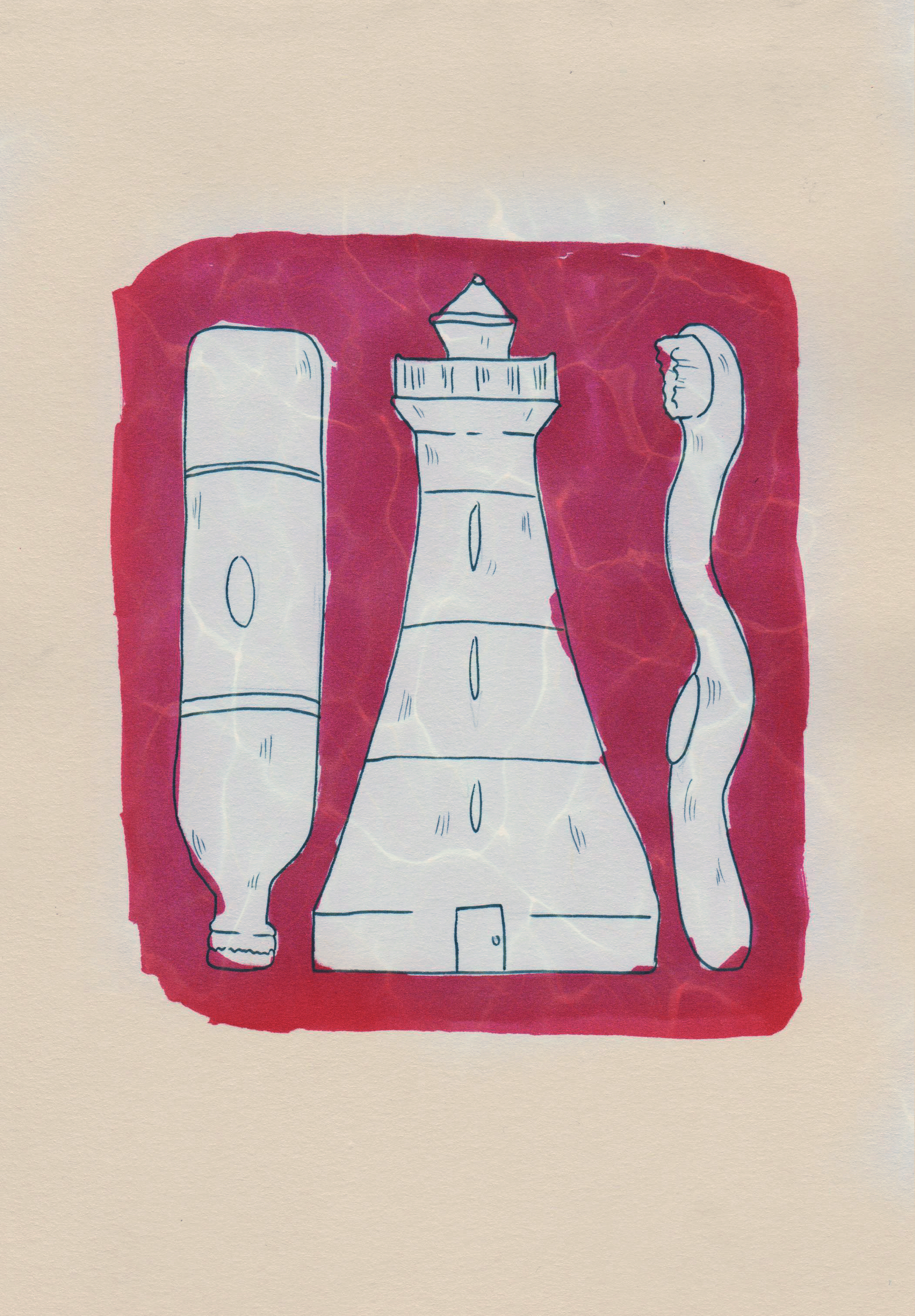
I also slightly changed the composition of the objects to a informative and tight knit fashion. I changed some of the objects themselves from my developments because i feel they were not as accurate to the story section as i liked. For example, the first inside illustration for my final outcome has been changed to fit a broken light bulb into it instead of the previous oars. This signifys in the story when the children first broke the light bulb and witnessed the golden light.
Again the four colours i chose for the background relate to the mood and emotional atmosphere of the 4 sections of thr story. It begins quite happy, confident, changing to a dangerous bright red.
Project Evaluation
This project ha been about exploring narrative illustration in a publishing context. I was given a selection of short stories to choose from and make a book cover and four inside illustrations to go with my chosen story.
My chosen story is called 'Light Is Like Water' It is a interpretative and imaginative story about two brothers who use the power of their childlike minds to travel the house on golden water from the light bulb in their house. This story really interested me because i like anything which has a sense of magic realism and fantasy.
The workshops really helped me fine different and varied ways of researching into my story, for example one of the workshops was about finding and sectioning areas of a story. This is called 'Scene Shift'
At the beginning of this project, i did sign up for the Penguin Competition but as the project went on i was struggling to find the time to do both project and competition work. I chose to leave because i wanted to focus on the project work. I still do not regret this decision.
Because i had three weeks to complete this project, i feel that i could have concentrated more of practical work as opposed to researching it, Although i am happy with the context of my developmental and experimental sketches and drawings.
One of the big influences of my final outcome are rooted from the idea of Spanish tiles and how they are related to the theme of water. I researched heavily into this topic but feel i could have designed a more varied amount of developmental drawings and designs for the front cover.
The final outcome itself originally was a sketched drawing on paper which i transferred into Adobe Photoshop to digitally draw it. I digitally drew this because i wanted to do something on the computer which i wasn't too comfortable in making into a book cover. The outcomes focal point is of the light bulb that the two brothers break when they first discover the golden water of light that floods the house in which they sail on but it has been drawn around negatively so the golden shape of it is emphasised. It also gives a sense of discovery when your eyes see the general shape of it.
The background is of the patterned Spanish tiles shaped to look like drops of water that are flowing to make the negative shape of the light bulb. I really like the colour theme of this piece because it has different and intricate shades of blue in which some are highlighted and gradiented in different shades which bring out the lightness of the bulb.
The final piece is also inspired by artist Coralie Bickford Smith who illustrated a range of cookery books with the theme of intricate tile like patterns to her pieces.
The colour scheme also has emotional value attached to it. the golden/yellow light suggests confident discovery and imagination while the blues suggest cold, looming curiosity. The darkness on the edges of the piece suggest looming negatively and bring a subtle border to the image. If i did this piece again, i would add more subtle formed objects into the patterned tiles to bring more sense of place and narrative.
I feel that i did more developments and experiments when it came to the inside illustrations for the short story. I really am pleased with the final outcomes because they hold this child like scribbling to thew background and are heavily influenced by artist Micheal Craig Martin who uses strong bold lines against bright vibrant forms of objects.
Overall i am pleased with my outcomes for this project as i feel i have met the brief by following the narrative and visually showing it through my illustrations.